

Visual Builder - Sections, Columns and Blocks
In this support article, we will be focusing on the building blocks that are used to create all possible page layouts and features within the Visual Builder. In case you haven’t already, we recommend that you first check out the ‘Visual Builder - Getting started’ support article before jumping into the details of Sections, Columns and Blocks.
Quick links:
It all begins with a Section

Whether it be your first time ever using Visual Builder, or if you are pro page builder - it all begins with adding your very first Section. You can go ahead and do this by simply clicking the green ‘+’ button.
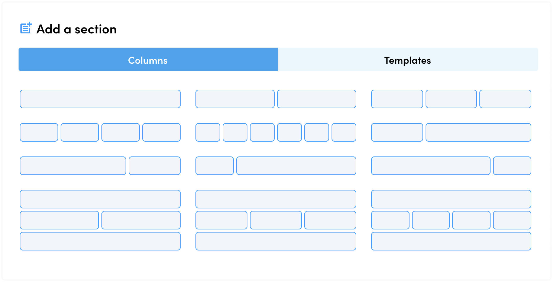
Option 1 - Using Columns
If you have a specific layout in mind, then Columns are a great way to get started. Simply select from the available Column variations that best matches the layout which you are setting out to achieve.
For example, below is a 2-column section with an image on the left and text related content on the right.
What if the column layout options available are not accurate enough?
Don’t worry, this is just to get you started. Once you have added one or more columns to your Section, you can easily add/remove more Columns and also fine-tune your Columns so that they exactly match your intended layout.

It is important at this stage to also think mobile-first, and consider how your page should look across multiple screen sizes. Each Section, Column and Block gives you the power to control and optimise that element for both smaller and larger screens. Another option is to create device specific content. We dive deeper into this in our support article ‘Visual Builder - Creating Mobile-first Experiences’.
Option 2 - Using Templates
The alternative to adding Sections by choosing a Column Layout, is to simply choose from our list of pre-built templates.We have pre-loaded Visual Builder with hundreds of templates, and this is just the beginning - more are on the way! The templates will also be home to any of your ‘Saved’ templates (jump to ‘Saving Templates’ for more on this).

Our templates have been categorised to make it easier to find what you are looking for, but there are no rules or limitations to the use of templates - you may even want to take elements from one template and add those elements to another, you can do that too! Then simply save your own templates. This makes it easy to quickly reuse and repurpose content as you require.
You will also notice that we have optimised our templates with both Dark and Light variations too, which can be filtered via the toggles which appear above the templates on the right hand side.
When you’re ready, go ahead and click on any template to have it appear on your page.
Section Customisation

When you hover over the Section tab, you will see a few icons slide out:
| Edit - This will open up the Section Sidebar. Here you can control everything about this section |
|
| Duplicate - This instantly duplicates the Section, and places that duplicated version underneath your current Section |
|
| Move - These arrows will move the Section in the respective direction |
|
| Save - This enables you to Save a Section as a Template |
|
| Delete - This will remove the Section and delete it from your page (note that you can undo this action by simply using the Undo/Redo feature via the Top Bar) |
Section Sidebar
Here you can control everything about your Section, beginning with:

- Columns is the ‘Content’ equivalent for Sections, giving you the control to fine-tune your columns and position them exactly as you need
- Layout is where you can configure the dimensions of your Section, and apply custom spacing or margins.
- Style will enable you to apply things like a background colour, image or video as well as other style related attributes
- Advanced is for the content creators who wish to dive a little deeper, whether you want to apply device specific visibility rules, add custom code or simply copy an entire page.
Columns

Columns are fundamental to the content within each Section. Columns are used to group blocks together in a structured way, and play a key role in ensuring that those blocks remain together as the page adapts to different screen sizes.
Column Customisation

When you hover over the Column tab, you will see a few icons slide out:
| Edit - This will open up the Column Sidebar. Here you can control everything about this Column. Note that column dimensions are controlled from within the Section |
|
| Duplicate - This instantly duplicates the Column, and places that duplicated version immediately to the right of your current Column (note this will stack underneath if the column is too wide - you can readjust the column dimensions from within the Section) |
|
| Move - These arrows will move the Column in the respective direction |
|
| Delete - This will remove the Column and delete it from your page (note that you can undo this action by simply using the Undo/Redo feature via the Top Bar) |
Column Sidebar
Here you can control everything about your Column, beginning with:

- Content will provide you with a quick link to the Section Column settings, such as adjusting the Column dimensions.
- Layout is where you can configure the layout of your Column, and apply custom spacing or margins.
- Style will enable you to apply things like a background colour, image or video as well as other style related attributes.
- Advanced is for the content creators who wish to dive a little deeper, whether you want to apply device specific visibility rules, add links and meta information.
Blocks

Blocks come in all shapes and sizes, some are simple and some are jam packed with many powerful features.
Let’s go through some of the Blocks which are available within Visual Builder, that said keep an eye out as new Blocks will continue to be added.

| Assets - Display a series of Fundraising resources, such as posters or social share graphics, which can be downloaded or viewed |
|
| Blog Posts - Displays a quick snapshot of each Blog Post |
|
| Button - Displays a single Button, with various styling options |
|
| Carousel - Displays a series of blocks within a sliding container |
|
| Code - Enables custom code to be contained within a Block. The sky is the limit with this Block type |
|
| Countdown - A time which keeps your audience informed on a significant date and time |
|
| Events - Display a quick snapshot of each Event |
|
| FAQ - A clean and consistent way to answer the most common questions |
|
| Fundraisers - Displays a quick snapshot of your Fundraisers |
|
| Icon - This block provides a quick and easy way to drop icons straight into your page |
|
| iFrame - Specifically dedicated to contain external content |
|
| Image - Displays a single image, with layout and style options |
|
| In-Page Navigation - Provides a quick, easy and structured way to bring navigation elements directly into your pages |
|
| Leaderboard - A real-time representation of your fundraisers, and their amount raised |
|
| Line - Simply put, this places a horizontal line on the page |
|
| Map - The quickest and easiest way to embed and display a map |
|
| Page Snippet - Displays a quick snapshot of each Page |
|
| Progress - Display realtime progress related data (e.g. Amount raised, fitness progress and group goals) |
|
| Scrolling Ticker - Displays a live feed of Donations or Fundraiser Registrations |
|
| Search - A quick and easy way to enable users to search |
|
| Shop - Displays a quick snapshot of Shop Products |
|
| Spacer - A simple way to a Block of empty space |
|
| Tabs - Group content within tabs |
|
| Text Block - The simple way to display text |
|
| Video - Dedicated to displaying video content |
|
| Web Form - Online forms to capture data |
Blocks Customisation

When you hover over the Block tab, you will see a few icons slide out:
| Edit - This will open up the Block Sidebar, here you can control everything about this Block |
|
| Duplicate - This instantly duplicates the Block, and places that duplicated version immediately to the right of your current Block (note this will stack underneath if the Block is too wide - you can readjust the column dimensions from within the Section) |
|
| Lift and Shift - Take a copy of the Block, and drop a duplicate of that Block wherever you see the blue '+' button |
|
| Move - These arrows will move the Block in the respective direction |
|
| Delete - This will remove the Block and delete it from your page (note that you can undo this action by simply using the Undo/Redo feature via the Top Bar) |
Block Sidebar
Here you can control everything about your Block, beginning with:

- Content is where Block specific content is managed. The Content which is made available here will vary depending on the Block which you have selected.
- Layout is where you can configure the layout of your Block, and apply custom spacing or margins.
- Style will enable you to apply things like a background colour, image or video as well as other style related attributes for that specific Block.
- Advanced is for the content creators who wish to dive a little deeper, whether you want to apply device specific visibility rules, add links and meta information.
Are you ready to learn more?
We hope that this article has helped you to understand the difference between Sections, Columns and Blocks.
When you're ready, we encourage you to continue your journey learning more about the many features within Visual Builder. Here are few links to keep you moving and kicking goals:
Visual Builder vs. Classic Builder, what is the difference?
Creating Mobile-first Experiences
If you have any questions and are unable to find the answers through our Visual Builder Support Articles, then please reach out to our amazing Support Team who will be happy to help you out!
