

Visual Builder - Getting Started
Visual Builder is your in-line site editor which is designed to streamline the creation of powerful, responsive and beautifully designed content pages.
This support article will introduce you to Visual Builder, and will quickly walk you through the basics as you get started.
What is Visual Builder?
Think of Visual Builder as your creative toolkit, a purpose built in-line site editor which will enable you and your team to create powerful and highly engaging content. It's easy-to-use by design, a more human and intuitive way to bring your vision to life.
Visual Builder enables you to create and edit your content in real-time, removing the guesswork and allowing you to shape and craft more engaging experiences through the eyes of your audience. Visual Builder allows you to immediately switch between devices - such as mobile, tablets and larger screens - so that you can preview, optimise and tailor experiences which adapt to your audience.
Let's begin
First log into your platform admin and navigate to your list of pages, here you can launch the 'Visual Builder' editor.
Don't see the 'Visual Builder' button? Please create a ticket and our Support Team will get it sorted for you.
Visual Builder Interface: Top Bar
Let's begin with some of the global interface elements, which you might find helpful as you create, update and switch between your content pages.
Switching between your Platform Admin and Visual Builder |

When in edit mode you can simply click the Funraisin logo to jump straight back into your Platform Admin, this is located at the top left your screen.
Setting pages to: Live, Offline and Archived |

Toggling your page status between Live, Offline and Archived is made easy via the status drop down, located at the top left your screen. Be sure to click Save to ensure your page status has been applied.
Support, Tips and More Tutorials |

We've also brought quick links to our Support Articles (just like this one!) in to Visual Builder, making it quick and easy to jump straight into the help and support that you might need.
View Options |

| Grid will highlight and place bounding boxes around all Sections, Columns and Blocks that currently exist on your page. This is a great way to quickly locate and identify any specific content and understand the page structure. |
|
| Dark Mode will apply a different theme style to your Top Bar. Give it a go and see which one you prefer :) |
|
| Hidden Content will reveal all content which has been set as 'hidden' (to hide content simply toggle between the device visibility options within each element). |
|
| All Device Content will reveal all content irrespective of the current device you are using. For example, you may be using Visual Builder on a standard desktop screen and wish to also see all tablet and mobile optimised content - this can be helpful to preview everything at once. |
Page Settings |

All of your overarching Page Settings can be controlled directly from within Visual Builder, giving you the ability to not only manage the page content but also those important page specific settings.
Undo / Redo |

This feature which is unique to Visual Builder will enable you to immediately jump back and forth between any changes that have been made between saves. Once you click 'Save' via the Top Bar, your previous changes will no longer be available.
Pages Menu (view all platform and event pages, and create new pages) |

That's right, you can do all of this from directly within Visual Builder. Making it incredibly easy to switch between pages and create brand new pages without ever having to leave Visual Builder.
Preview Mode |

Although what you see in Visual Builder is a good representation of what your audience will see, sometimes you want to be sure and also simply hide all of the Visual Builder interface controls. This Preview Mode will enable all of that.

Once in preview mode, you can jump straight back into Visual Builder by simply clicking the Funraisin logo which will be located within the tab at the top left. Note that only your logged in Site Admins will see this tab on pages which Visual Builder is available - your audience will not see this tab.
Desktop, Tablet and Mobile Modes |

It's more important than ever that your pages are optimised for each and every touch point. This device mode will enable you to quickly switch between these different devices, and is a great way to test your pages. We recommend still testing your pages within the actual devices which you wish to support, and their respective browers.
Save |

You guessed it. This will 'Save' your page changes, but keep in mind that you will still need to Publish your page in order for those changes to become live and visible to your audience.
Publish |

When you're ready, and happy with the page - you can go ahead and click this button to Publish all changes and make your page live to your audience.
Adding Sections
Visual Builder is your mission control for creating powerful pages and having the freedom to create anything, and that is exactly what we had in mind when we began developing this creative toolkit.
First it is important to consider the three main structural elements which are used to create responsive content pages. Understanding and getting your structural foundation right, can make light-work of device optimisation and ensure a great experience across all touch points - not to mention better page performance, accessibility and speed scores.

Think of Sections as your largest building blocks, which are stacked together to form your page. A section will be the very first thing that you will add to any page.
You can add Sections by simply clicking the 'Green Plus Button' on your page.
When you add a new Section, you will have two options:
Option 1: Select a layout style
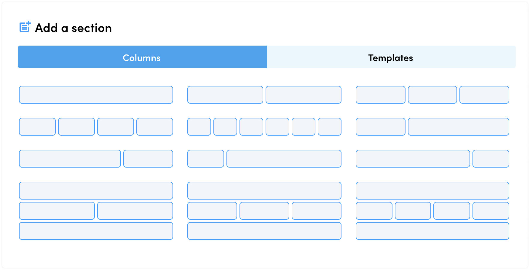
Simply choose the number of columns you feel you need, and jump straight in to adding your content. Keep in mind you can always click on your Section settings and fine tune just about everything, from the number of columns through to the many available style attributes.
Option 2: Select a template

Our team has hand-crafted some of the of the most proven, trialled and tested layouts which we know perform well and appear great across all screens. With just a single click on one of these templates, you will immediately drop your selected template straight into your page. Feel free to fine-tune that template with your own images, messaging and any other blocks you feel are needed. You can also save Sections as your own templates, which will then be available for future use. We have more on this in our Sections, Columns and Blocks tutorial.
Next we have Columns, which live within Sections.
Columns

Columns will help break up your section into your preferred layout, and will assist with how your page will adapt and respond to different screen sizes.
You can add Columns via the respective Section Settings. Next we have Blocks, which live within Columns.
Blocks

Blocks generally consist of things like text, images and videos but with Visual Builder you also have access to more Fundraising specific Blocks such as leaderboards, donation tickers, event rolls, and much more.

You can add Blocks by simply clicking the 'Blue Plus Button' within any Column.
We've created a whole tutorial which focuses on Section, Columns and Blocks.
Sidebar

The Sidebar is where all the magic happens, giving you full control over each and every element on your page - whether it be Sections, Columns, Blocks or even your Page Settings. Simply click on any of these elements within your page, and you will see the Sidebar fly in from the right side of your screen.
Within the Sidebar, you will notice a series of Tabs at the top. These tabs enable you to jump through the various available settings for that element - such as:
- Content - Update and control the main content within your element and any sub-features which are unique to that element
- Layout - Fine tune things like padding, alignment, margins and all things relating to the layout of your element
- Style - Tweak the styles for your element such as colours, borders, effects and shadows
- Advanced - Dive deeper into things like device visibility, custom classes & code, and much more
To learn more about our Sidebar, head on over to our tutorial on Sections, Columns and Blocks.
Are you ready to learn more?
We hope that this article has given you basic understanding of the Visual Builder, and how it might benefit you and your team.
When you're ready, we encourage you to continue your journey learning more about the many features within Visual Builder. Here are few links to keep you moving and kicking goals:
Visual Builder vs. Classic Builder, what is the difference?
Creating Mobile-first Experiences
If you have any questions and are unable to find the answers through our Visual Builder Support Articles, then please reach out to our amazing Support Team who will be happy to help you out!
