No two online fundraising events are the same, and therefore no two entry forms are the same. A one size fits all registration journey simply doesn’t provide for the best results.
Funraisin enables you to completely control the user journey of a fundraiser when signing up to an online event.
Funraisin is a true multi-event platform in that you are able to create as many online or offline events as you wish, but within each event, you are also able to create as many registration journeys as you like. This allows you to manage and test unlimited entry flows to ensure you have the best flow for each event and device.
Catering for Different Entry Types
We all know that registration forms can often be made too complex, often going over multiple different steps so trying to fit all scenarios into a single entry flow can easily increase frustration levels resulting in lower completion rates.
We generally find that it is smarter to let the entrant choose upfront on what type of entry best fits their needs. By creating multiple registration journeys, you are able to manage different entry flows for different types of users in a simple and elegant way.
Creating unique registration flows for different entry types such as individuals vs Teams vs Businesses / Schools vs Family Entries etc. can often then also help setup up a fundraiser’s expectations around the steps involved in their registering rather than making them think on the fly.
Below shows an online event that has several different registration flows. You’ll notice:
- Default registration form
- Team entry flow
- Family entries
- Express (Lightbox)
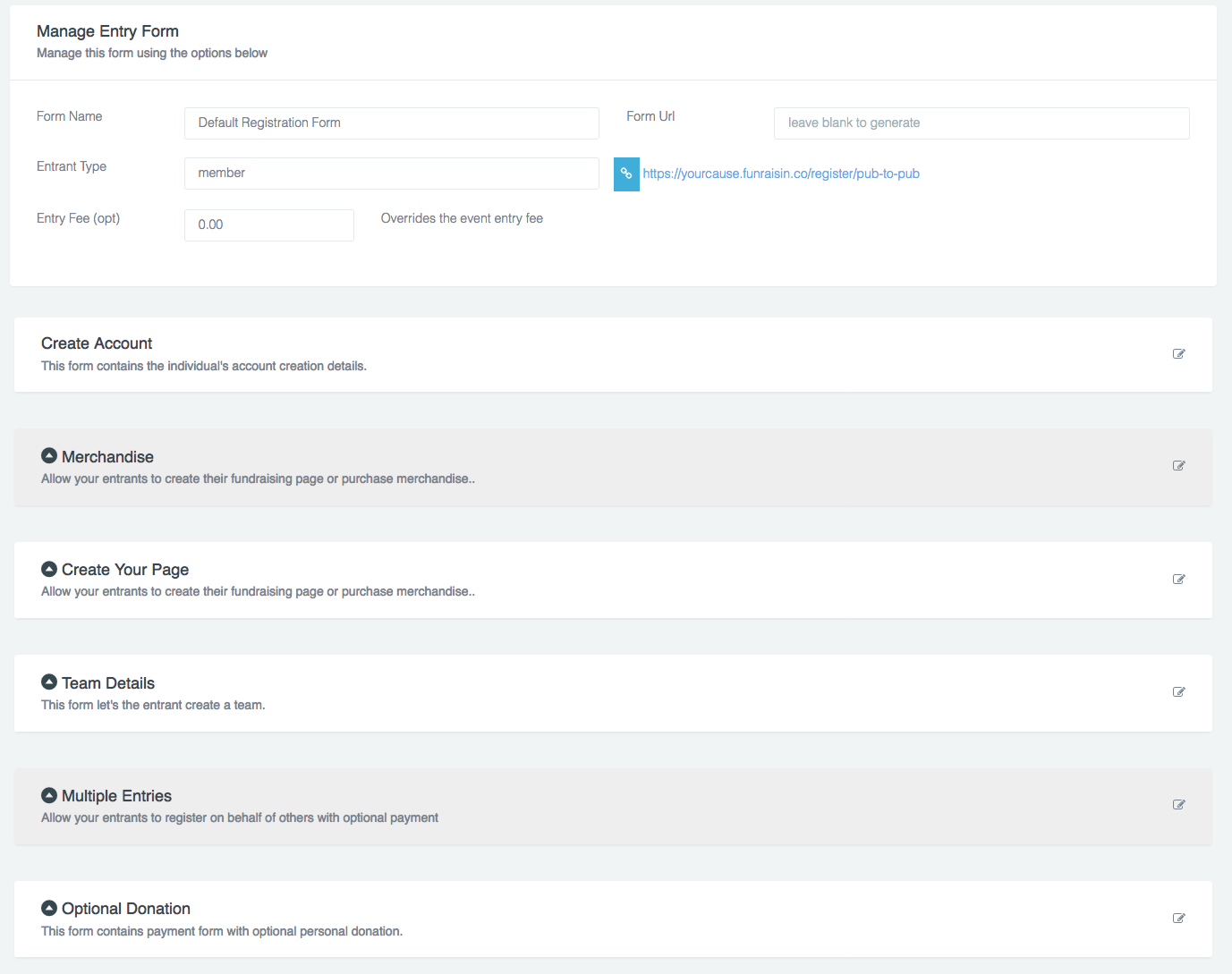
Within each Entry form are multiple steps you are able to enable or disable. And within each steps you’re then able to turn on or off data capture fields to best suit your needs.

If you would like to know more about setting up entry forms read this support article here.
Tracking a Fundraiser’s Progress
Usually, with standard registration systems, there is very little configuration as to what fields are able to be enabled / disabled but on top of this, it’s then very difficult to get feedback as to what parts of an entry flow are causing roadblocks with your fundraisers.
Being able to track step-by-step progress as a fundraiser steps through the entry flow is vital to being able to understand what they are and aren’t liking when it comes to registering for your event.
Funraisin not only allows you to customize what fields and steps are available within each of your entry flows, but we also track the progress of each fundraiser within each flow so at any time you are able to access any incomplete entries and analyse drop off points to then be able to go back and adjust your signup forms.
Below shows the steps of the Default Registration Form. Steps in white are enabled and steps greyed out have been disabled.

Catering for Mobile vs Desktop
Most sites cater for mobile users by shrinking down forms using CSS styling to help make them more palatable on a smaller device. This one size fits all approach gets by but you are still often left with heavy registration flows that are still clunky for mobile users even though the fields are being modified.
Since Funraisin has completely separate templates for Mobile vs Desktop you are also able to create different entry flows for different devices, disabling form elements or even entire steps for Mobile users that would otherwise create a negative experience for a smaller screen.
The diagram below shows an entry flow used just for mobiles where only 2 of the steps are in use.

Testing What Works Best
Being able to access data on where users are getting stuck is one thing, but imagine being able to setup multiple journeys to track completion rates across different journeys to further help you understand what works best for your fundraisers and events?
Because Funraisin is able to support unlimited entry flows, and track progress of all users within each journey, you can easily direct your traffic through different journeys using an A/B link to determine entry flow is delivering the best results.
Below shows the entry flow progress for a Fundraisers record.

To Lightbox or Not?
Lightbox entry flows can often increase completion rates by providing a cut-down version of an entry form, allowing the user to skip quickly through a signup process to then provide additional information later on if and when it’s needed.
Funraisin supports both lightbox and non-lightboxed entry flows allowing you to create unlimited options for any event to then track completion rates.
This easily allows you to discover when a quick lightbox style entry form is best suited vs a more traditional entry flow.

If you’d like further help please pop in a support ticket from your Funraisin admin and our team will assist you.


